Cabin Rental Website Design: What a Good Cabin Booking Page Should Include
Why cabin rental website design matters A cabin rental website should do more than show a few nice photos. Guests usually want to understand...
Why cabin rental website design matters
A cabin rental website should do more than show a few nice photos. Guests usually want to understand the stay, the location, the booking process, and whether the cabin feels trustworthy before they check availability or send an inquiry.
Good cabin rental website design should make the private stay feel clear, calm, and easy to book. The page needs to explain the cabin experience while also guiding the visitor toward the next step.
For many owners, the website becomes the main place to explain the property outside Airbnb, Vrbo, Booking.com, or social media. That is why the page structure, photos, booking path, and trust sections matter.
A cabin website should explain the stay first
The first job of the page is not the booking button. The first job is helping the guest understand what kind of cabin stay they are looking at.
A good cabin rental page should quickly answer:
- Where is the cabin located?
- How many guests can it sleep?
- Is it better for couples, families, groups, or remote workers?
- What makes the cabin worth booking?
- What should the guest do next?
If these details are not clear, the visitor may leave even if the property is beautiful. A strong page makes the cabin easy to understand before asking the guest to book.
The hero section should be clear and focused
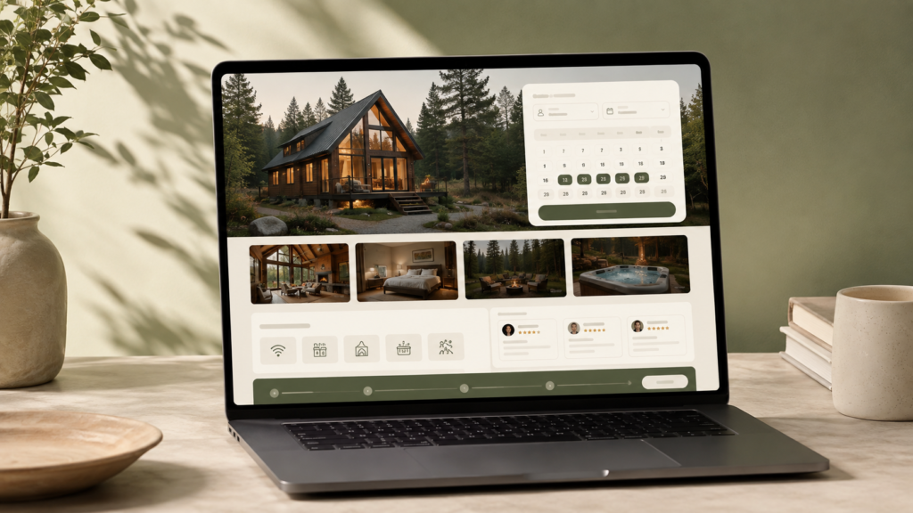
The hero section is usually the first thing a guest sees. It should not be overloaded with generic words or too many buttons. For a cabin rental website, the hero should clearly communicate the property type, location feel, and main booking action.
A strong cabin rental hero section can include:
- A clear headline about the cabin or private stay
- A short line explaining who the stay is for
- A high-quality cabin image or website mockup
- A primary button for checking availability or sending an inquiry
- A secondary button for viewing photos, amenities, or work examples
The goal is not to make the page look busy. The goal is to help the guest understand the stay and continue naturally.
Photos should support the booking decision
Cabin rental guests care about atmosphere, privacy, views, bedrooms, outdoor space, and comfort. Photos should not be placed randomly. They should answer guest questions.
A good photo structure may show:
- Exterior cabin view
- Living area
- Bedrooms
- Kitchen or dining space
- Outdoor seating, fire pit, hot tub, deck, or forest view
- Nearby lake, mountain, trail, or private setting if relevant
For a vacation rental website design, photos should support the guest journey. They should help people imagine the stay, not just fill space on the page.
The booking path should be easy to understand
A cabin rental website can use different booking flows. Some owners want instant direct booking. Some want an inquiry first. Some connect the website with a booking tool, while others send guests to an external booking platform.
The important thing is that the page should make the booking path clear. Guests should not wonder whether they need to call, submit a form, check a calendar, or click an external booking link.
A clean direct booking website setup can include:
- Availability calendar
- Booking widget
- Inquiry form
- Booking request button
- External booking link
- Clear next-step explanation
The best option depends on how the property is managed and whether the owner wants direct bookings, booking requests, or inquiry-first leads.
Calendar sync should be planned before the design
Many cabin owners list their property on Airbnb, Vrbo, Booking.com, or another platform. If the website has its own booking or inquiry flow, calendar sync needs to be planned before the page is built.
A booking channel sync setup helps the owner understand where availability should come from and how blocked dates should be handled.
For a simple cabin website, iCal sync may be enough to share unavailable dates between calendars. For a larger or more automated setup, a booking tool or channel manager may be better.
Trust sections are important for private cabin stays
Cabin guests often want reassurance before booking. A private stay can feel personal, remote, or unfamiliar, so the website should reduce uncertainty.
Good trust sections can include:
- Guest reviews or review highlights
- Clear house rules
- Location notes
- Cancellation or booking policy summary
- Frequently asked questions
- Host or property manager introduction
- Security deposit or payment explanation if needed
Trust does not need to feel heavy. A clean cabin rental page can use short sections, clear wording, and calm design to make the booking path feel safer.
Mobile layout can make or break the page
Many guests compare cabins from their phones. If the mobile layout feels cramped, slow, or confusing, the page can lose serious visitors.
The mobile version should keep the most important details easy to scan:
- Property summary
- Photos
- Guest capacity
- Amenities
- Availability or inquiry button
- Location and FAQs
Buttons should be easy to tap, sections should not feel too long, and the booking action should be easy to find without becoming aggressive.
What a good cabin rental website page should include
A strong cabin booking page usually includes a clear mix of story, trust, and booking direction.
- Hero section with the cabin promise
- Short property overview
- Photo gallery
- Guest capacity and stay details
- Amenities section
- Location or nearby experience section
- Calendar, booking widget, or inquiry form
- Reviews or trust content
- FAQs
- Final call-to-action
The page should not feel like a generic template. It should feel built around the property, the guest, and the way bookings actually happen.
Common mistakes in cabin rental website design
Some cabin rental websites look nice but still do not help guests move toward booking. The most common mistakes are simple.
- The page uses large photos but does not explain the stay clearly
- The booking button appears before the guest understands the property
- The mobile layout makes the guest scroll too much
- Amenities are hidden or hard to scan
- The calendar or inquiry flow is unclear
- The page has too many calls-to-action
- There is not enough trust content before the booking step
A better page keeps the experience simple. It gives guests enough information, then guides them toward the next step.
How I usually plan a cabin rental website
Before designing the page, I usually look at the property type, booking setup, current listing links, photos, amenities, and how the owner wants guests to contact or book.
After that, the website structure becomes easier to plan. A cabin rental website should not just look polished. It should make the stay easier to understand and the booking step easier to take.
If the cabin uses Airbnb, Vrbo, Lodgify, Guesty, Hostaway, Beds24, Smoobu, or another booking setup, the page should be planned around that real workflow.
Final note
A good cabin rental website design should feel calm, clear, and booking-focused. The page should explain the property, build trust, show the guest experience, and make the next step obvious.
For cabin owners, the website can become a stronger direct booking asset when the design, content, calendar setup, and booking flow work together.
Need help planning a cabin rental website? Request a website review.
Want a cleaner booking path?
Send your property link, current booking setup, or existing website before planning a rebuild.