Lodgify Website Examples: What a Good Direct Booking Page Should Include
Why Lodgify website examples matter When property owners search for Lodgify website examples, they are usually not just looking for a pretty homepage. They...
Why Lodgify website examples matter
When property owners search for Lodgify website examples, they are usually not just looking for a pretty homepage. They want to understand what a booking-focused website should include before a guest checks availability, sends an inquiry, or books directly.
Lodgify is often used by vacation rental hosts and property managers who want a direct booking website, calendar sync, booking tools, and connected property management in one setup. Lodgify also offers booking widgets that can be added to an existing website, including WordPress sites, so the website can stay custom while the booking flow is handled through Lodgify.
A good Lodgify website should explain the property clearly
The first job of the website is not the booking widget. The first job is helping the guest understand the stay. A strong Lodgify website example should make the property type, location, guest fit, amenities, and booking path clear before the guest reaches the booking step.
For a villa, cabin, apartment, boutique hotel, or serviced apartment, the page should answer simple guest questions quickly:
- What kind of stay is this?
- Where is it located?
- Who is it best for?
- What makes the property worth booking?
- What should the guest do next?
The booking flow should not feel disconnected
A common mistake is placing a booking widget on a weak page and expecting it to convert. The booking tool helps with dates, availability, and reservations, but the page still needs a clear guest journey around it.
A better setup uses the website content to build trust first. Then the booking widget, availability section, or call-to-action appears when the guest has enough context to take the next step.
What strong Lodgify website examples usually include
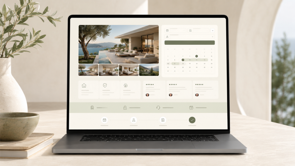
A good Lodgify website design usually includes more than one booking button. The page should be structured around trust, clarity, and direct booking intent.
- A clear hero section with the property type and main booking promise
- Property photos that show the stay, rooms, views, and guest experience
- A short property story that explains why the stay is worth booking
- Amenities and stay details in a clean, scannable layout
- A booking widget, availability section, or clear inquiry path
- Guest trust signals such as reviews, policies, location notes, and FAQs
- Mobile-first layout, because many guests compare properties from phones
- Clear next-step buttons, not too many competing actions
Where the Lodgify booking widget should appear
The booking widget should be easy to find, but it should not be the only useful part of the page. For many stay websites, the best placement is after the guest has seen the property promise, key photos, and basic stay details.
On a single-property website, the booking widget can appear near the top and again near the bottom. On a multi-property website, each property page should have its own clear booking or availability path.
Single property vs multi-property Lodgify websites
A single-property Lodgify website can stay simple. It may only need a homepage, property page, gallery, amenities, FAQs, and booking section. The goal is to make one stay easy to understand and easy to book.
A multi-property website needs a stronger structure. Guests may need to compare locations, property types, bedrooms, amenities, rates, and availability. In that case, the website should help guests choose the right property before pushing them into the booking flow.
Why mobile layout matters
A Lodgify website example can look good on desktop and still fail on mobile. Vacation rental guests often browse quickly, compare multiple listings, and check availability from a phone. If the booking section, property details, and photos feel cramped or confusing, the guest may leave before taking action.
The mobile version should make the next step obvious. Important content should not be buried under long sections, oversized images, or repeated text. The booking path should stay visible, but not aggressive.
How a custom website can work with Lodgify
Some property owners use Lodgify’s website builder. Others prefer a custom WordPress website and connect the booking flow with a Lodgify widget or booking link. The right choice depends on design needs, SEO goals, property count, content structure, and how custom the site needs to feel.
A custom website can be useful when the owner wants stronger brand presentation, custom sections, portfolio-quality design, SEO-focused service pages, or a more controlled guest journey. Lodgify can still handle the booking side while the website handles presentation and conversion.
Common mistakes in Lodgify website examples
Some booking websites look technically connected but still feel weak to guests. The most common issues are simple:
- The page talks about booking before explaining the stay
- The design looks like a generic template
- The booking button appears without enough trust content
- Photos are not organized around guest questions
- The mobile layout makes the guest work too hard
- The website has too many buttons with no clear priority
Final note
The best Lodgify website examples are not just pages with a booking widget. They are clear, trust-building websites that help guests understand the stay and then move naturally toward checking availability or booking directly.
If you already use Lodgify, the website should be planned around your actual booking setup, property count, and guest journey. That keeps the site easier to use and makes the direct booking path feel more intentional.
Need help planning a Lodgify based direct booking website? Request a website review.
Want a cleaner booking path?
Send your property link, current booking setup, or existing website before planning a rebuild.